Thursday 7 April 2011

SPX Daily Chart - 6 April 2011

     After closing above the 1332.28 target (dashed horizontal purple line on the chart) on April 1, the break was qualified on April 5. The next target higher must now be discussed, and it is derived from two distinct TD Sell Setups. Both are shown by the number nine on the chart with the first having finished on February 11. After completing a Sell Setup a market will usually reverse course, if there is going to be a change in trend, within four sessions. The market peaked five sessions after that first setup - note the word 'usually' was used! The second sell setup completed on March 31 and four sessions have now passed.
     There is always an associated 'risk' level with each completed sell setup. If broken in a qualified manner you can say that the odds favor a continue run higher until at least the completion of sequential or combo countdown. The two risk levels of concern now constitute our next price target higher. They are shown on the chart by dashed lines and are at 1345.5 and 1344.04. The location of these lines mean that we are essentially looking at a retest of the February high.
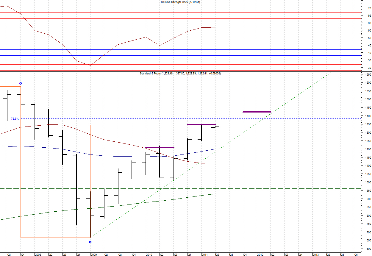
     Another point of interest that I continue to watch on all the charts is what the RSI indicator is saying in its role as a trend indicator. On the daily chart it said a bear market began at the mid-February high. In fact, the current rally sees the RSI still below the area reserved for resistance in bear markets (shown by the parallel red horizontal lines), so we can still call the rally from the mid-March low as a counter trend rally.
     Bottom Line: Price is now testing the February high and critical sell setup resistance levels while the RSI shows that, if this is only a corrective rally, we have about run out of steam. The market is at a key decision point. The daily chart remains in a bearish mode with the allocation mix at a +50% reading. The chart would turn bullish with a qualified break of 1345.5. My next post will be on Monday.

Wednesday 6 April 2011

SPX Weekly Chart - 5 Apr 2011

     What should we be doing on the weekly chart? What the monthly advised: watching closely for signs of a reversal. After registering a countdown 13 bar the cash SP500 fell for a month but has since bounced and is now reaching for the previous high.
     Along with the '13' bar was a bearish divergence between the RSI (top pane) and Composite Index (middle pane). Now, on the bounce, the RSI has moved right into the area reserved for resistance in bear markets. Not that the RSI has signaled a bear trend on this chart yet, but often times such a signal will begin with a reversal in this area.
     Next note the small blue arrows on both the price and RSI charts on January 28 and March 18. While the closing price was higher on March 18 than January 28 the RSI was lower. This is known as an RSI positive reversal and can be used to project a price target. Such a calculation yields 1345.87 which is slightly higher than the February top. And so a retest of the high is not unexpected. Keep in mind that these targets only work out if the underlying trend remains bullish - so there is good reason the monthly chart has us watching closely. The weekly chart is showing that a possible reversal took place at the February high or is at hand now.
     Bottom Line: The weekly chart is in a bearish position. Will it stay that way? It will take a confirmed break of the 1363.53 risk level to return this chart to a bullish position. I will update the daily chart tomorrow.

Tuesday 5 April 2011

SPX Monthly Chart - 31 Mar 2011

     Yesterday's quarterly review noted that we were at a TD Trend Factor target. Does this mean we have made at least a temporary top? The monthly chart is telling us to watch closely.
     The cash SP500 completed a TD Combo countdown to bar #13 in February 2011. In my work this is not an automatic "sell" signal. That requires both a price flip (within the next year) and monthly price pulse sell signal; and both must occur before the signal risk level of 1402.02 is broken in a qualified manner.The fact that prior TDST resistance is at 1404.05 reinforces the notion that the signal risk level is one of importance.
     A price flip will occur in April if we close the month below 1257.64. The Price Pulse is a bit more complicated. To turn bearish would require either a print below 1249.05 (if we make a new high this month) or a print below the July 2010/July 2001 trendline (weekly basis). This trendline rises from about 1135 to 1150 through the month.
     If the March 2009 low started a new Elliott Wave pattern then we are currently in the third wave of a five wave impulse pattern or wave 'C' of a zigzag.
     Using the RSI (top pane) as a trend indicator we can see that a bear market was signaled on this time frame in September 2008. Of great interest right now is that we have rallied exactly into the area reserved for bear market resistance. That is, this indicator is saying that if the rally from 2009 is corrective in nature we have run out of steam.
     Bottom Line: The monthly chart remains in a bullish position but is telling us to watch closely for signs of a reversal. I'll take a look at the weekly chart tomorrow.

Monday 4 April 2011

SPX Quarterly Chart - 31 Mar 2011

     You might want to review the last Quarterly chart postings of January 5 and 6. Those postings and the prior yearly review explained why I believe that the market, in terms of Elliott Wave, either ended Cycle Wave IV or finished just the first part of it (A of IV) at the 2009 low.
     As the price decline from the 2007 high made a qualified break of TDST Support in late 2008 (the dashed green horizontal line at 960.84),  the trend is down. Additionally, when the RSI indicator (top pane) is used as a trend indicator we can see that a bear market was signaled at the same time when the area reserved for bull market support (parallel solid blue lines) was broken. Putting these two facts together implies that the rally from the 2009 low is most likely corrective in nature; particularly since the RSI is still under the area reserved for bear market resistance (parallel solid red lines).
     A corrective rally can be quite substantial, and recall in the last quarterly review that the quarterly price pulse is bullish. Combine that with the fact that corrective Elliott "B" waves can go to new highs, and it means that the rally still may have room to run higher. In fact, the only immediate concern on this chart is that we are at a TD Trend Factor target (purple line). Notice that the decline from April - July 2010 occurred from such a previous target.
     Bottom Line: The quarterly chart analysis should be used as background for the lower time frame charts. I will take a look at the new Monthly chart tomorrow.